

The future belongs to the curious.

The future belongs to the curious.
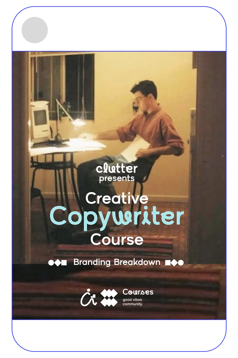
Brand Identity for a Company That Brings Clarity
Date
18 Feb 2026
Project
Brand Identity
Clutter is not about mess.
It is about what happens before clarity.
In a world overloaded with information, interfaces, and noise, Clutter positions itself as a system that organizes, simplifies, and makes thinking lighter. The identity had to reflect this philosophy — not by looking chaotic, but by demonstrating how structure can emerge from constraints.
This project was about designing clarity, not decoration.
_gif.gif)
Clutter’s identity is built on a disciplined foundation:
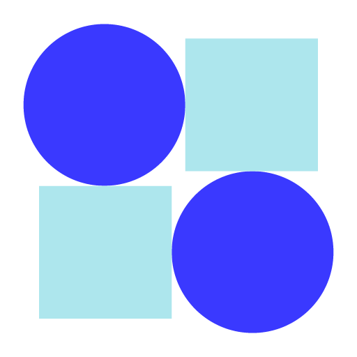
The perfect circle and the perfect square. By limiting the entire system, from icons and shapes to card blocks and layouts, to these two geometric primitives, we created a language rooted in clarity, harmony, and scalability. This constraint ensures visual consistency across platforms while keeping the brand timeless and non-trendy. The logo embodies this philosophy through clean geometry, precise spacing, and deliberate balance. It doesn’t rely on decoration; it communicates through proportion. Designed to adapt seamlessly across digital, print, product, and social environments, the mark doesn’t compete with content — it frames it.
Clutter’s identity is built on a disciplined foundation: The perfect circle and the perfect square. By limiting the entire system, from icons and shapes to card blocks and layouts, to these two geometric primitives, we created a language rooted in clarity, harmony, and scalability. This constraint ensures visual consistency across platforms while keeping the brand timeless and non-trendy. The logo embodies this philosophy through clean geometry, precise spacing, and deliberate balance. It doesn’t rely on decoration; it communicates through proportion. Designed to adapt seamlessly across digital, print, product, and social environments, the mark doesn’t compete with content — it frames it.
_2x.webp)
Icon
Wordmark

Designed as a system,
not a symbol.
The Clutter logo is conceived as a modular system rather than a fixed mark. It is built from two core elements - the icon and the wordmark. The combined lockup is the primary and most recognizable expression of the brand. In digital or space-constrained environments, the icon acts as a compact shorthand, while the wordmark may stand alone where brand familiarity already exists. Each configuration is guided by context, hierarchy, and clarity.


Line form
Butt cap stroke
solid shape

A simple curve, a single dot, a quiet box. Together they form a gaze; the curious eye leaning into the unknown. It is a symbol of exploration, of finding clarity within chaos, and of stories waiting to be discovered.


Built from fundamentals.
Designed for clarity.
The Clutter iconography system is rooted in geometric purity and deliberate simplicity. Each icon is constructed from two essential forms, the perfect circle and the perfect square, used as consistent building blocks across the system. This disciplined constraint creates visual harmony, balance, and a timeless quality across applications. Through union, subtraction, and overlap, these absolute forms generate a visual language that is both intuitive and distinct. The result is a coherent set of icons that feels structurally sound, visually balanced, and uniquely ownable - reflecting a brand defined by clarity, precision, and thoughtful construction.
// Iconography

Secondary Unit
- Solid State
Primary Unit
- Solid State
// Icon library


// Icon library
// Icon library monochrome


// Icon library monochrome
Colour Palette
Where energy meets ease
Clutter begins with blue — not just any blue, but one that feels alive.
Clear like open sky.
Deep like thought. Steady, but never dull.
Orange arrives like a spark. Warm, confident, impossible to ignore.
It brings movement —
the feeling that something is about to happen.
Gold yellow glows gently in between.
Not loud. Not flashy. Just a quiet reminder of
warmth and possibility.
And then the air enters.
Lavender that feels light and slightly playful.
Sky blue that feels open and honest.
Creamy off-white that gives everything room to breathe.
Nothing fights for attention.
Nothing feels heavy.
The palette feels awake, but relaxed.
Bright, but kind.
Strong, but human.
// Colour palette
Hex 3a39ff
RGB: (58, 57, 255)
Hex ff5822
RGB: (255, 88, 34)
Hex f2bb05
RGB: (242, 187, 5)
Hex dbb8ff
RGB (219, 184, 255)
Hex aee6ed
RGB (174, 230, 237)
Hex f4f1ea
RGB (244, 241, 234)
Primary
colour
Secondary
Colours
Base
colours


Marks of Intent
Distilled intent, in geometric form.
Each content pillar is represented by a custom mnemonic —
a compact symbol built from our core shapes: the circle and the square.
Rather than using generic icons, we created marks that reflect how each pillar thinks and operates. The same geometric DNA runs through all of them, but the arrangement shifts — suggesting dialogue, movement, experimentation, assembly, or narrative.
These mnemonics act as visual shorthand.
They simplify without reducing meaning.
Different functions.
One cohesive system.

Logo -icon
Title
Tag-line
Supportive-icon


At LK Studio, we approach every brand
as a story waiting to find its structure. With Clutter, the narrative wasn’t about chaos — it was about what emerges when you impose thoughtful constraint. By reducing the identity to its most essential forms, we built more than a visual system; we built a framework for clarity. Because when strategy shapes design, the result doesn’t just look cohesive — it tells a story that can grow, adapt, and endure.
Brand
Clutter Company
Client
Bhargav Golla