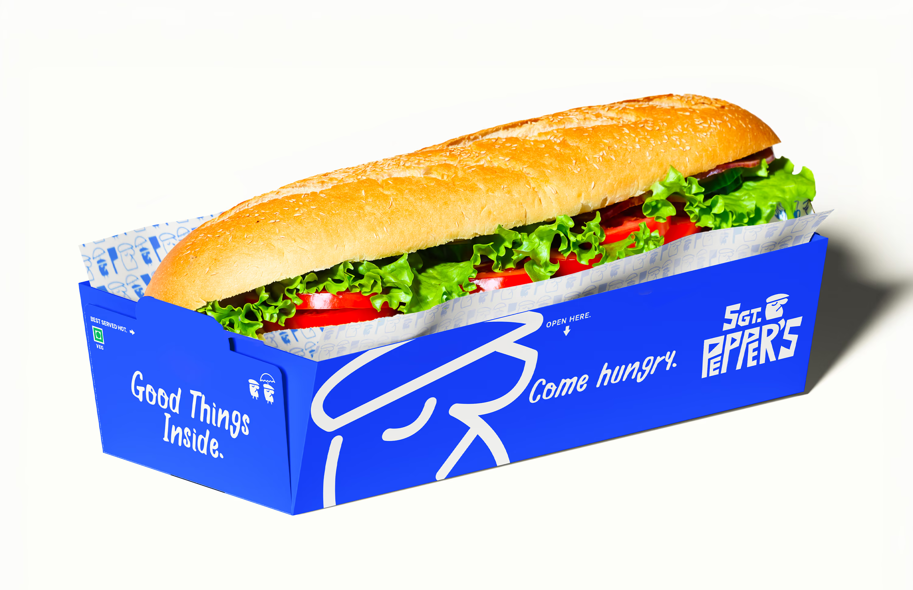
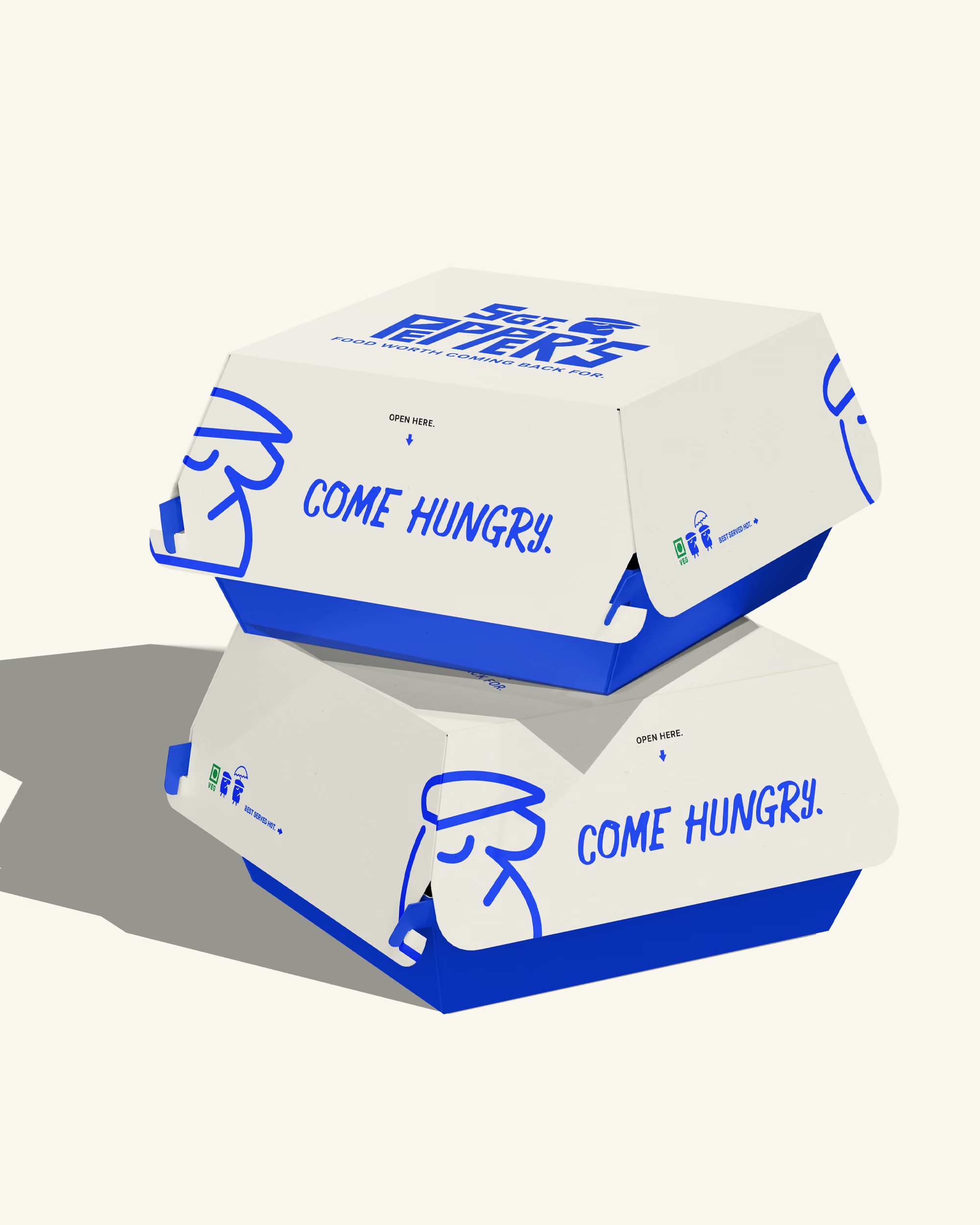
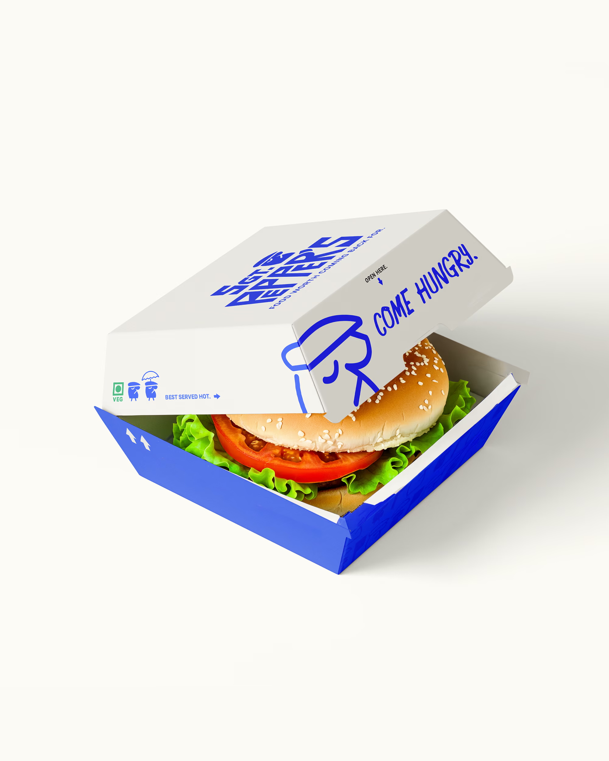
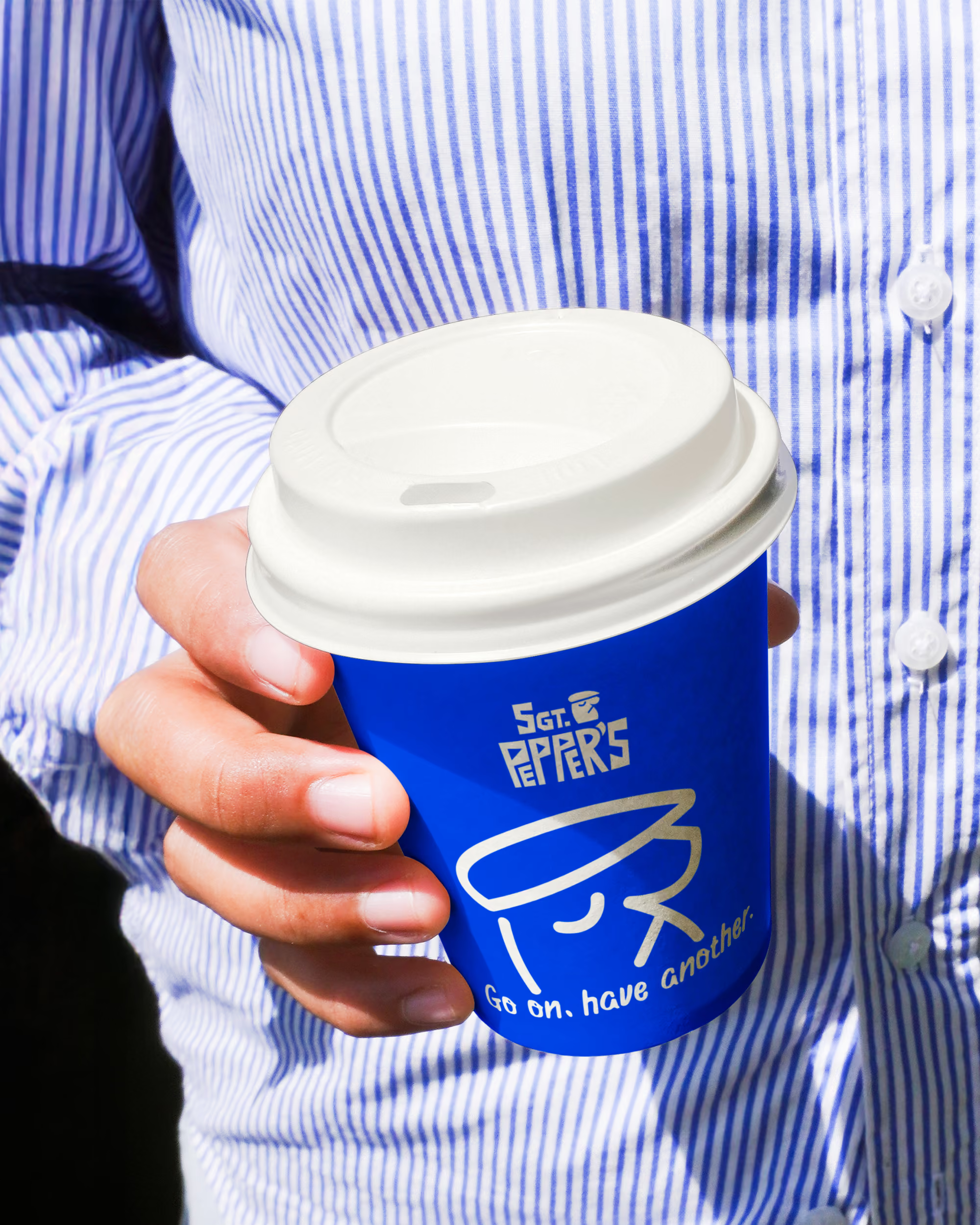
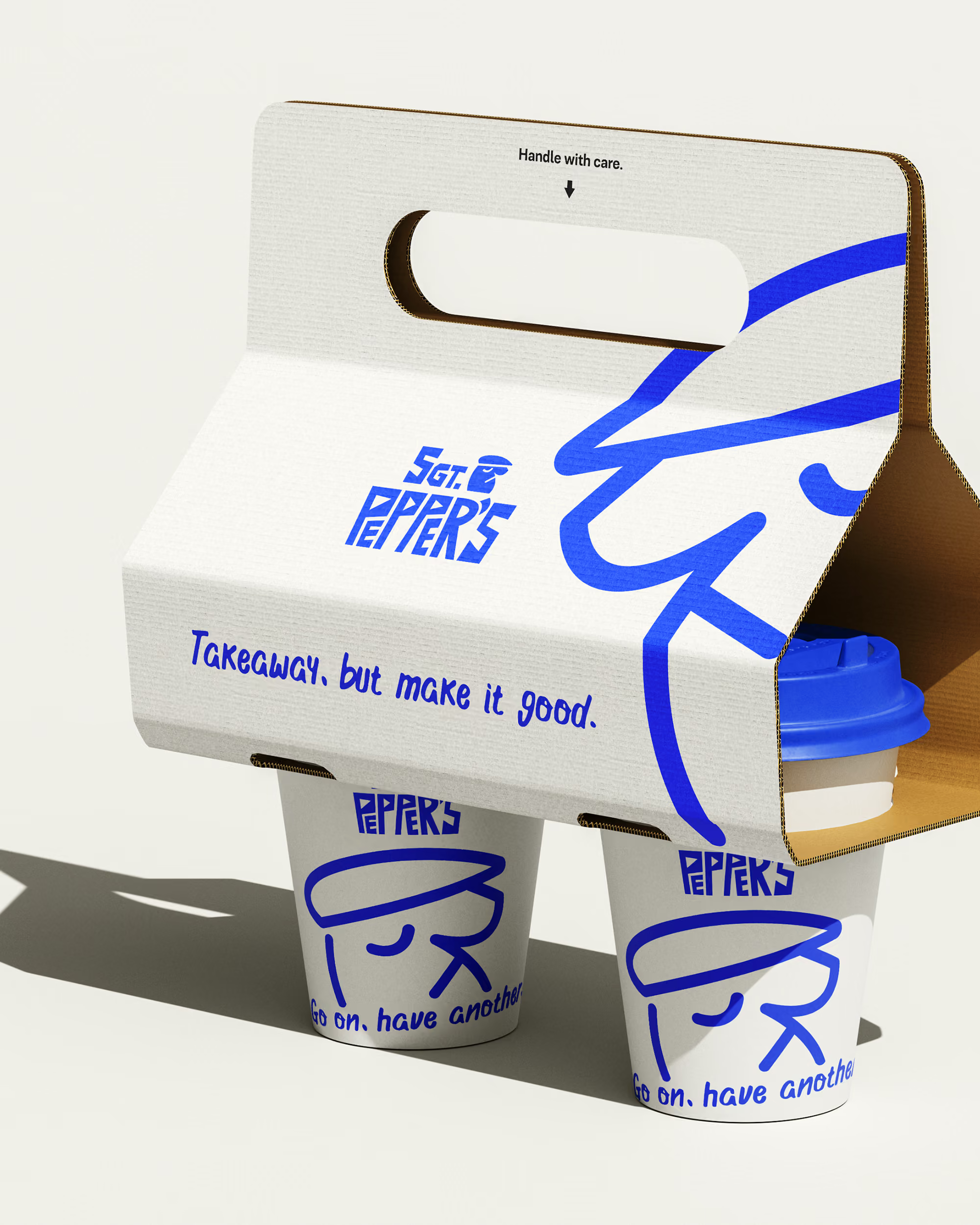
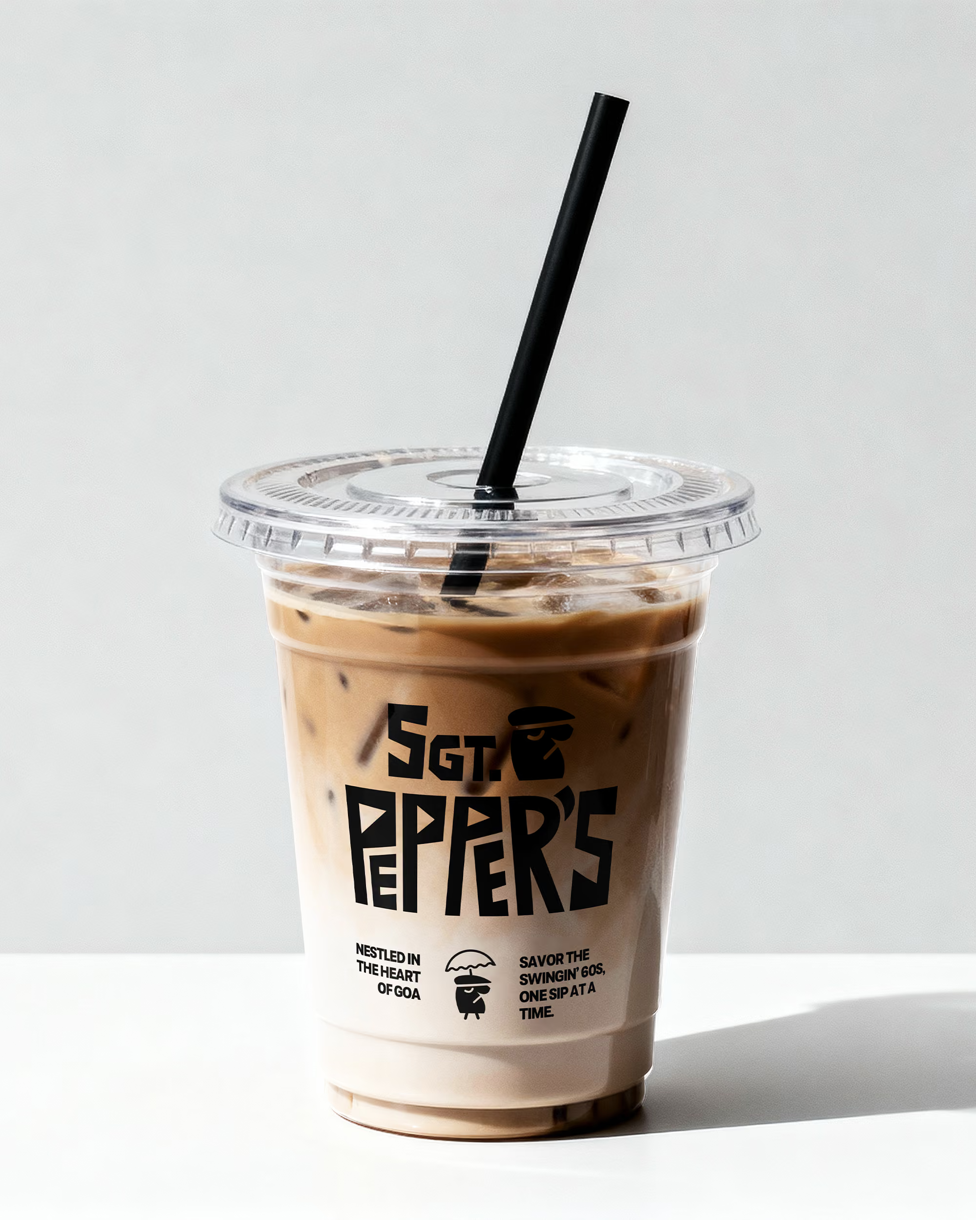
Sgt. Pepper’s is where the free spirited energy of 60s psychedelia meets the bold, experimental world of modern Japanese cuisine. Set in Goa, the brand draws from the visual language of the Beatles era and the irreverent spirit of the hippie movement, bringing the two together into a food truck that feels playful, unexpected and distinctly its own.
From the identity and packaging to the illustrations and overall visual language, we built a world that feels as adventurous as the food itself. Bright, expressive and slightly eccentric, every element was designed to capture the spirit of experimentation while keeping the brand rooted in the laid back, colourful character of Goa.
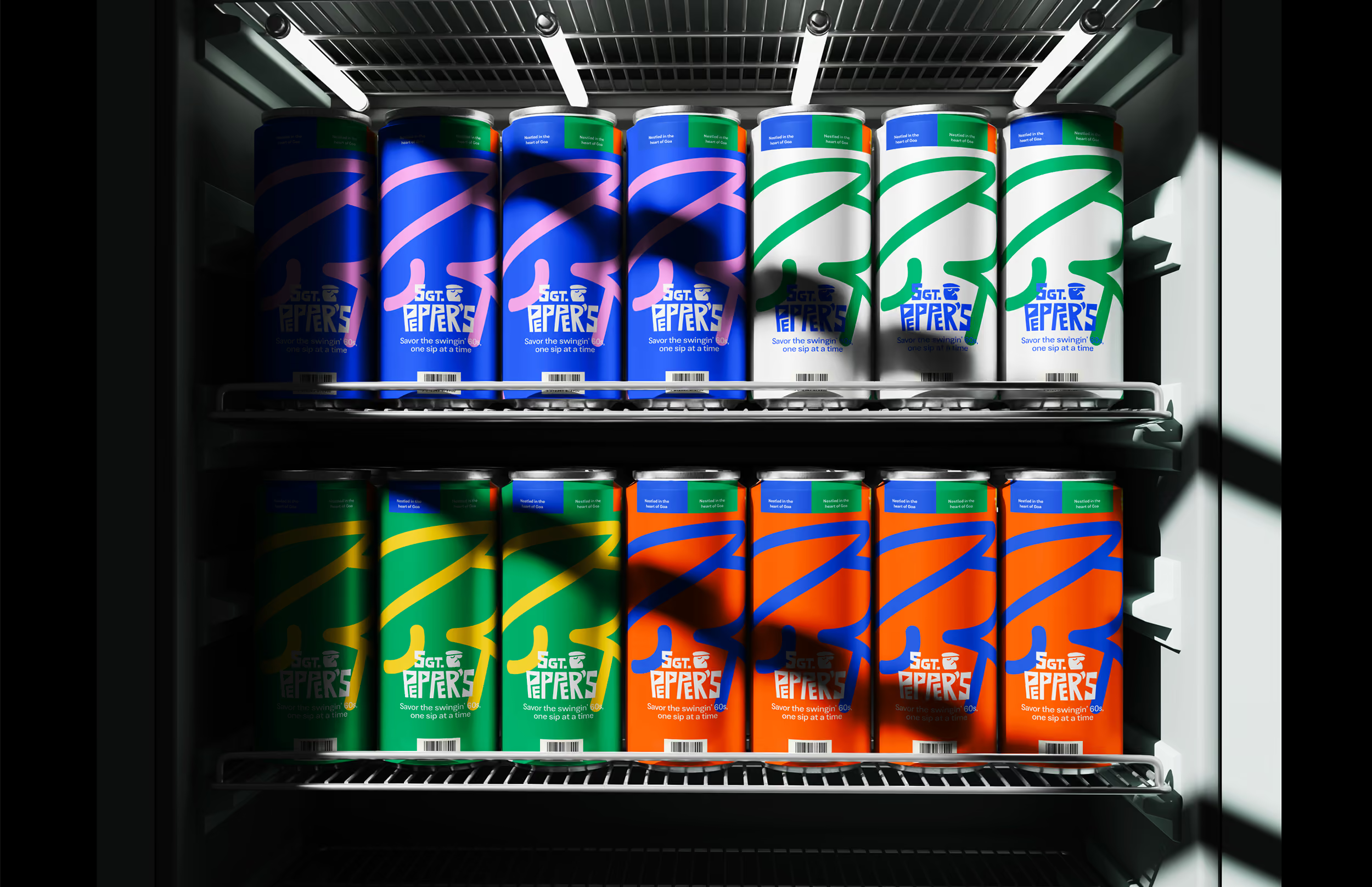


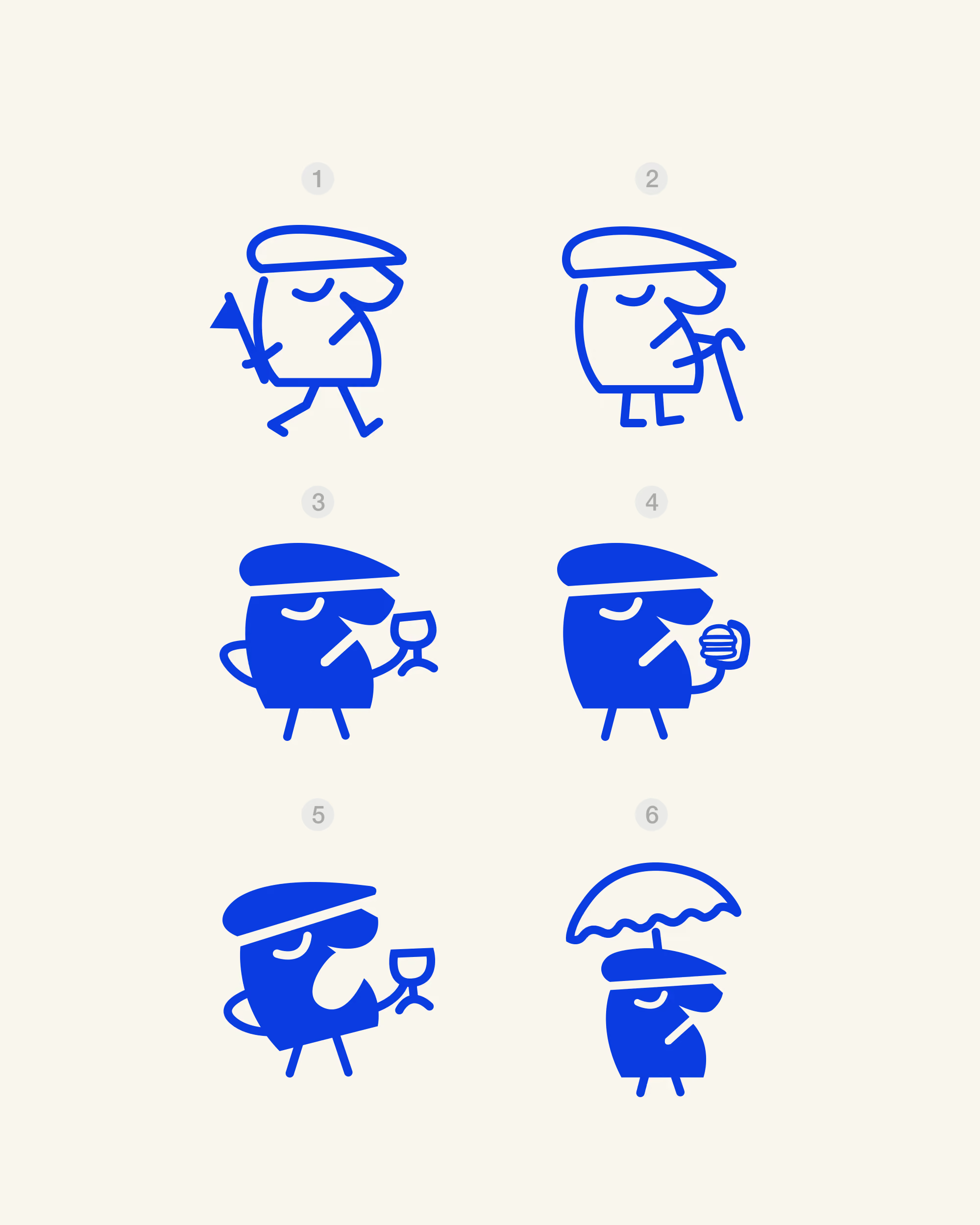
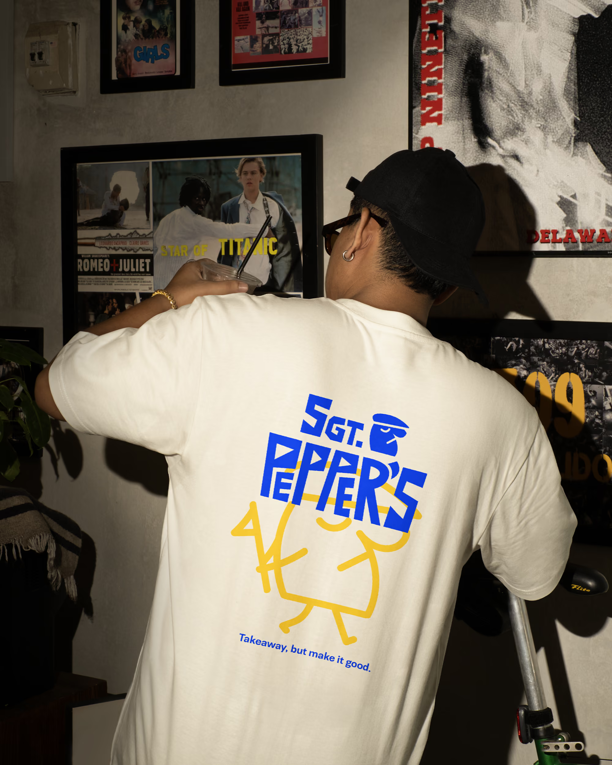
The character in the Sgt. Pepper’s logo is a stylized figure wearing a beret, embodying the cool, rebellious spirit of 60s mod culture. With a confident and slightly mischievous expression, the character gives the brand a distinct personality while nodding to the early hippie culture of Goa and the psychedelic influence of the Beatles.More than just a visual element, the character became a symbol of the brand’s bold, creative and unconventional approach to fast, experimental cuisine. It adds a sense of attitude and playfulness to the identity, making Sgt. Pepper’s feel like a brand with a personality of its own.
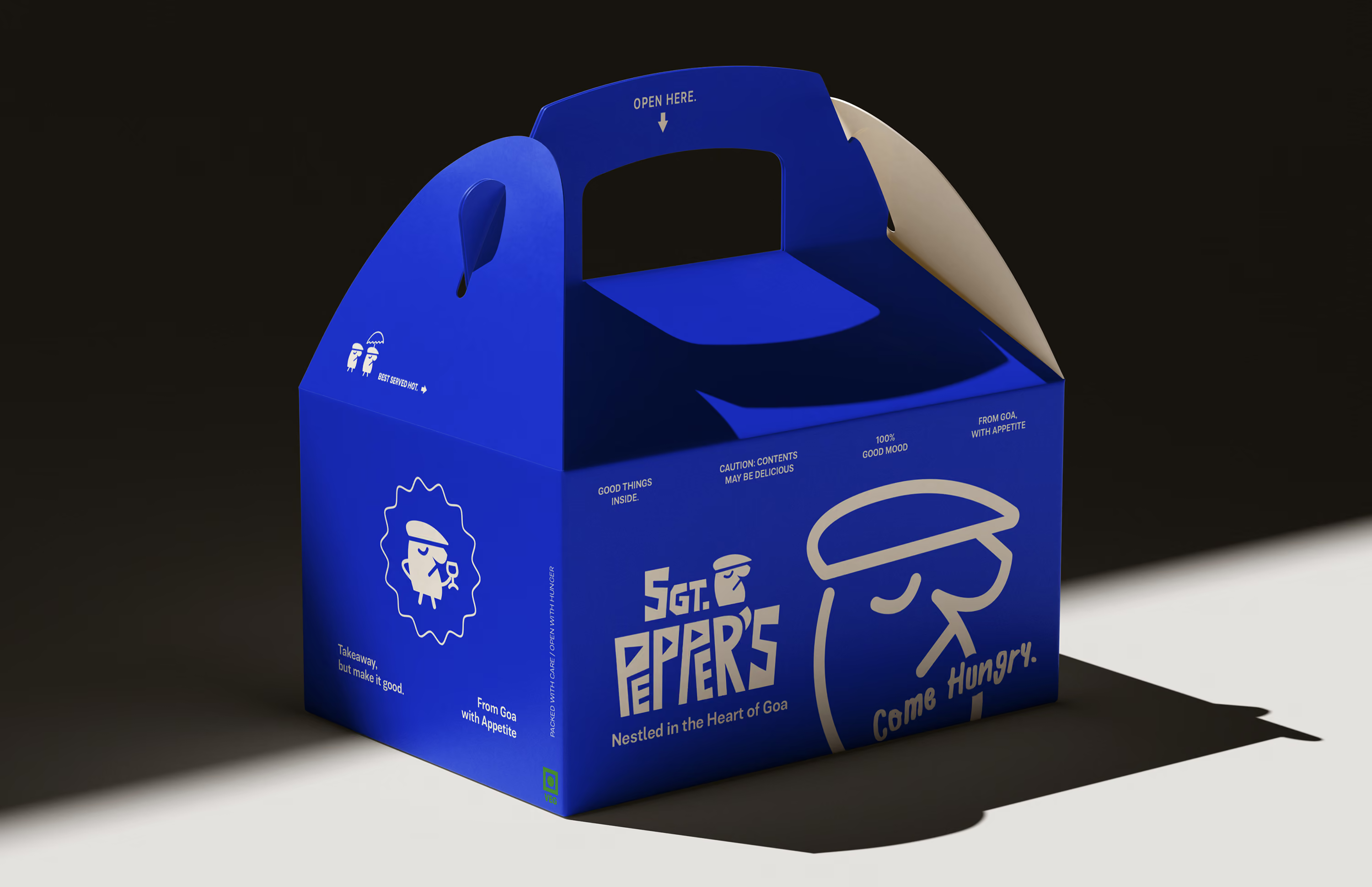
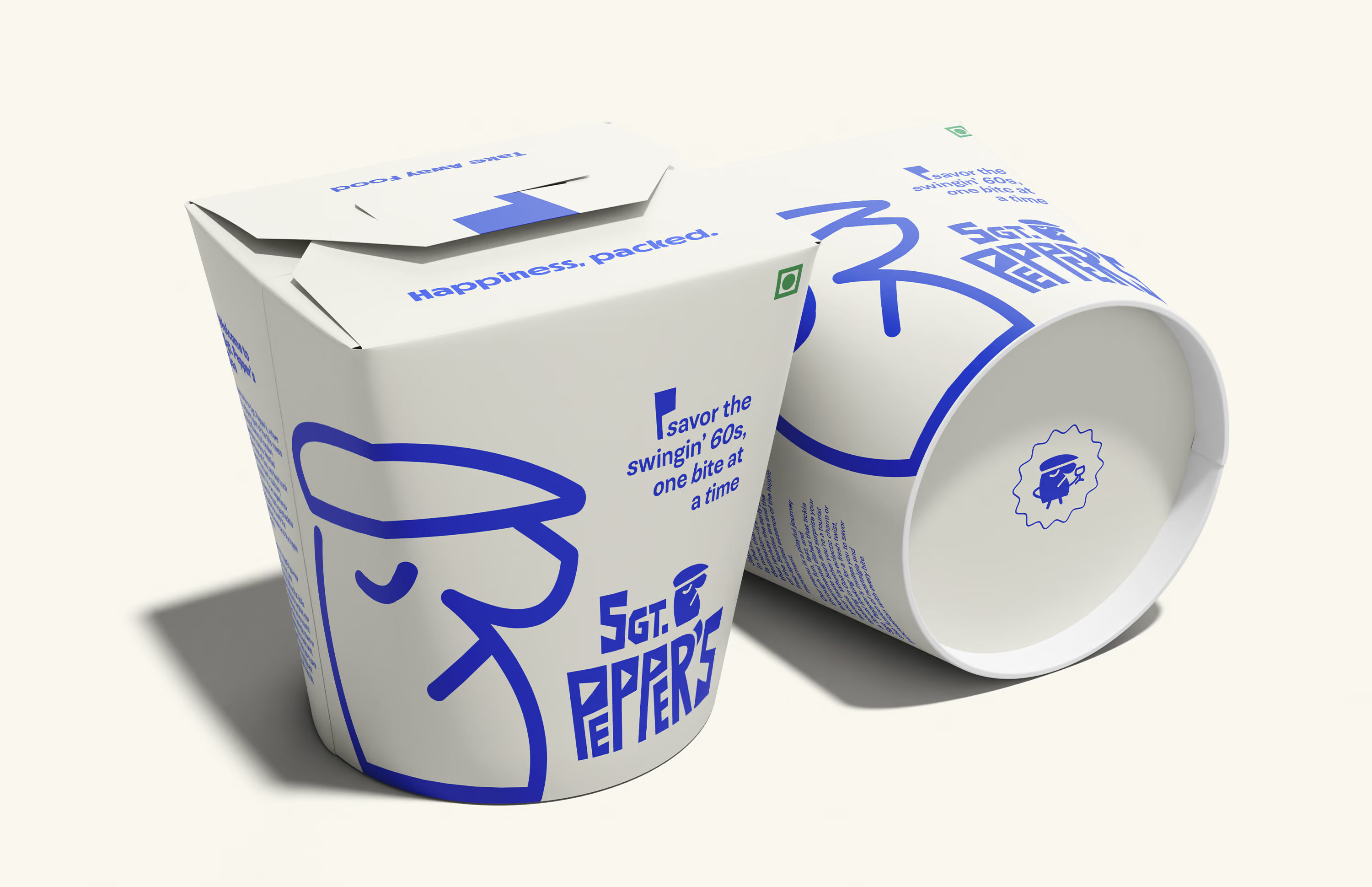
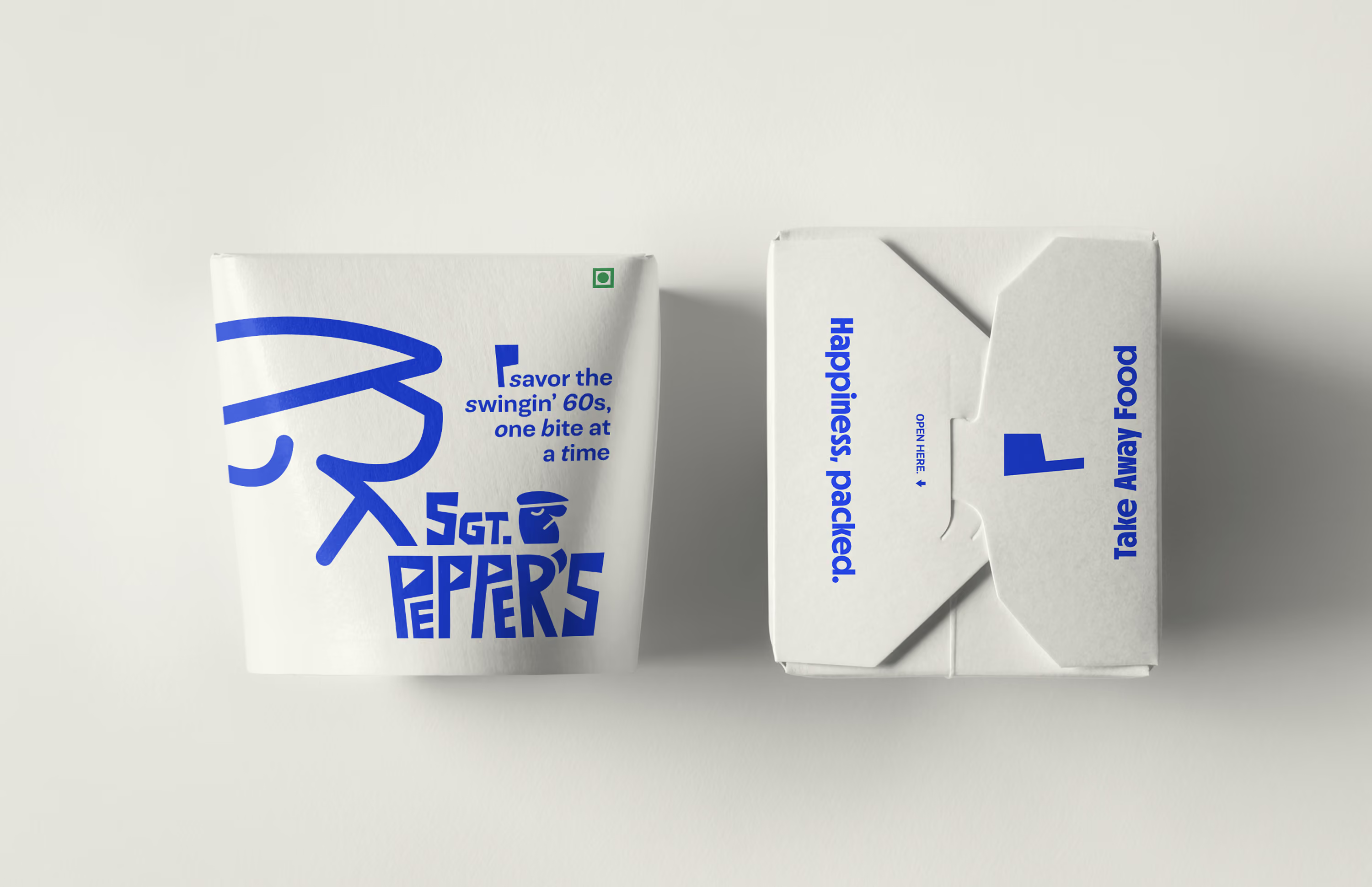
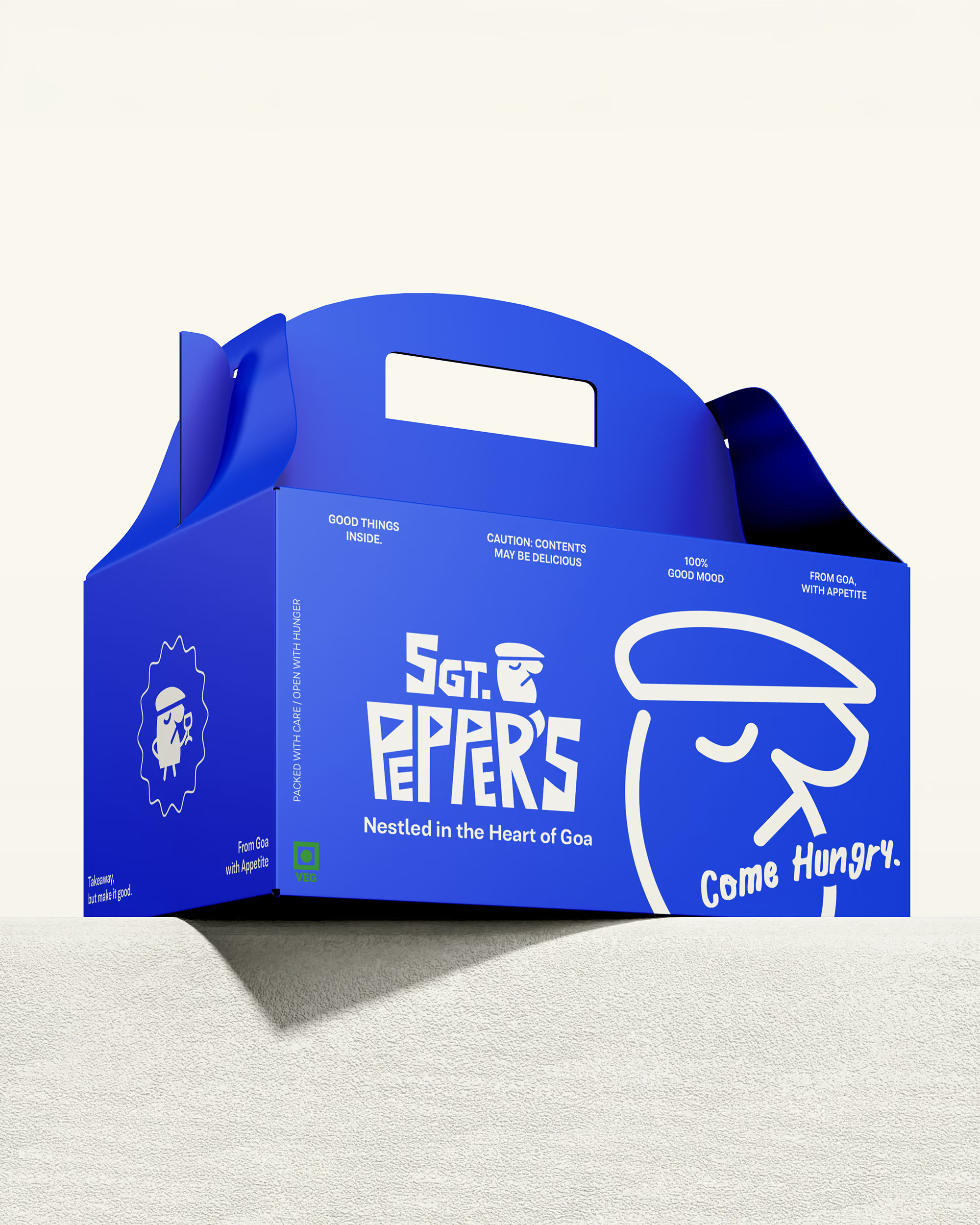
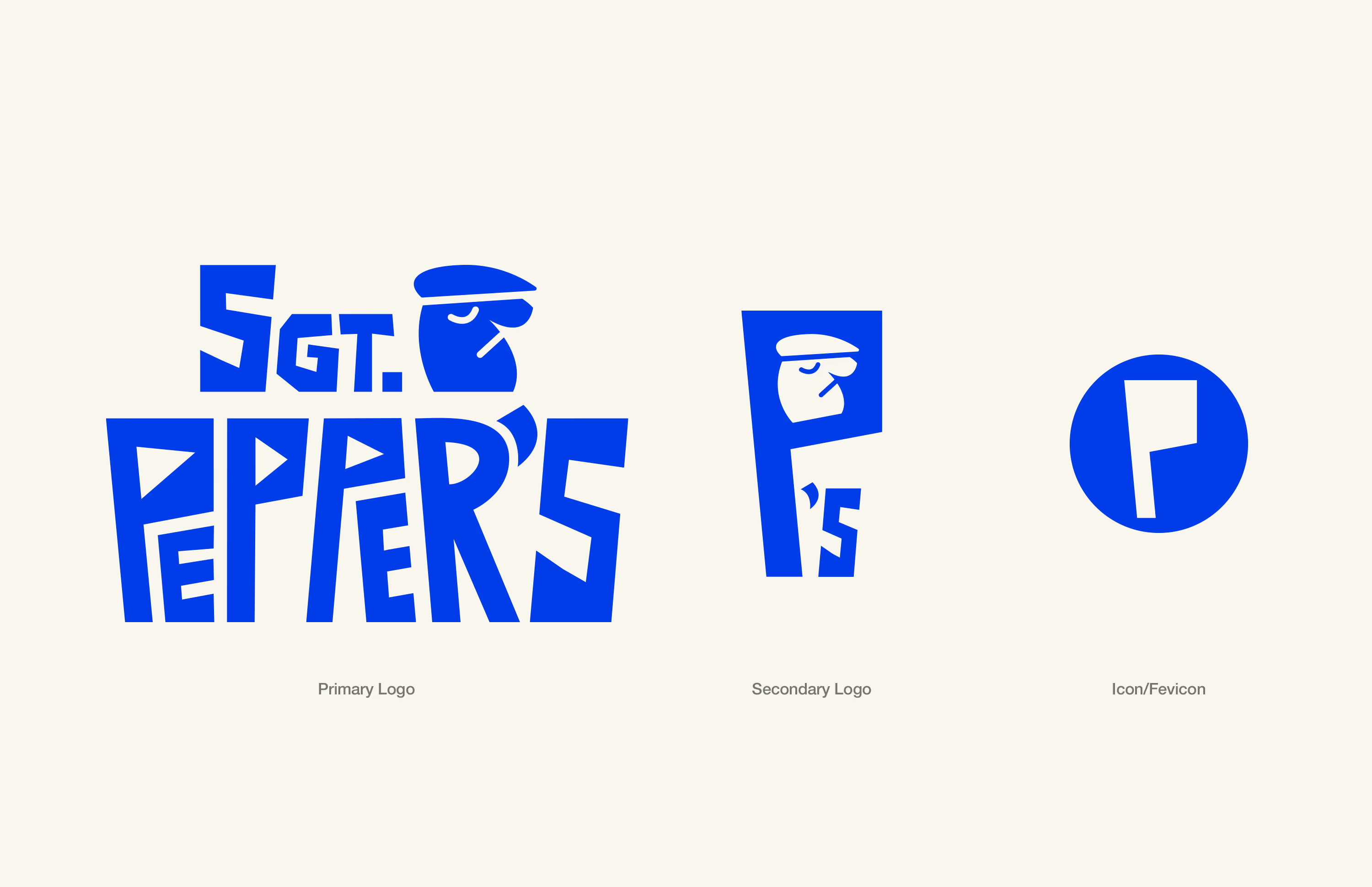
The Sgt. Pepper’s logo features two key elements: the wordmark and a beret wearing character. The wordmark’s four prominent letters, PPPR, represent the four band members and are designed with bold, geometric typography in a vibrant blue hue. This combination reflects the brand’s energetic and playful essence. The angular design and varied line thickness evoke a sense of movement and dynamism, while the beret wearing character offers a nostalgic nod to 60s mod culture.
Together, these elements capture Sgt. Pepper’s mission to fuse the psychedelic spirit of the Beatles era with modern, fast and experimental Japanese cuisine in the heart of Goa.